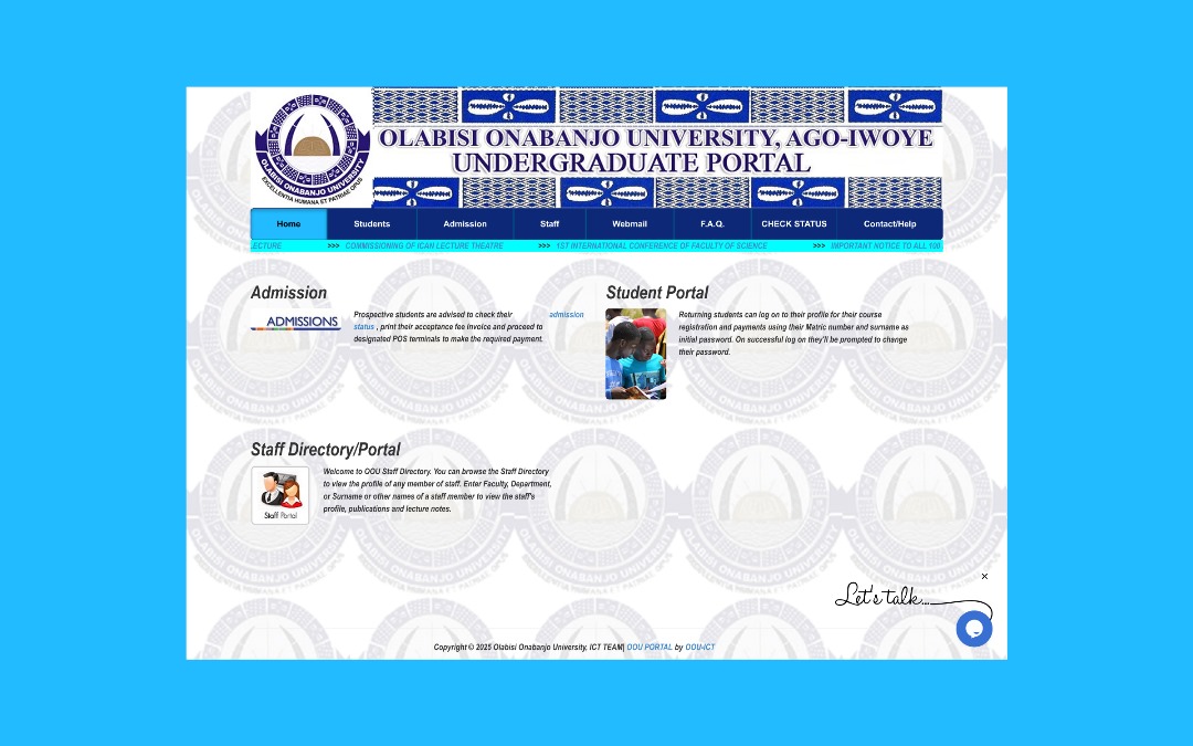
The OOU portal is the university’s primary system for results, document verification, fee payment, and other administrative workflows. Over time the interface became cluttered, provided poor visual hierarchy, and created friction particularly for non-technical students and third-party operators who rely on the portal during peak events (e.g., results release).
The Problem
Users faced confusing navigation, inconsistent information architecture, and frequent technical errors during high-load events. The portal was difficult to use on mobile and lacked an inclusive experience for less tech-savvy users.
The Goal
Design a clean, maintainable portal that surfaces essential tasks quickly, reduces cognitive load, and works reliably across devices. While creating a small, pragmatic design system for consistent implementation.
My process
I followed a practical, outcome-driven process: understand, ideate, iterate, and validate — balancing quick usability wins with system-level improvements to information architecture.
01
Discovery & Audit
I used hands-on exploration of the live portal to document the most common pain points and gather annotated screenshots for a heuristic audit. This made it possible to prioritize improvements that would have immediate impact for students and staff.
Annotated screenshots and notes used during the audit phase.
02
Mapping & Ideation
I mapped core journeys (students, staff, cyber-café operators), sketched paper wireframes, then validated information architecture changes with low-fidelity screens. These sketches shaped how navigation and dashboard affordances would be reorganized.
Wireframe iterations informed IA improvements and flow simplification.
03
Design & Systemization
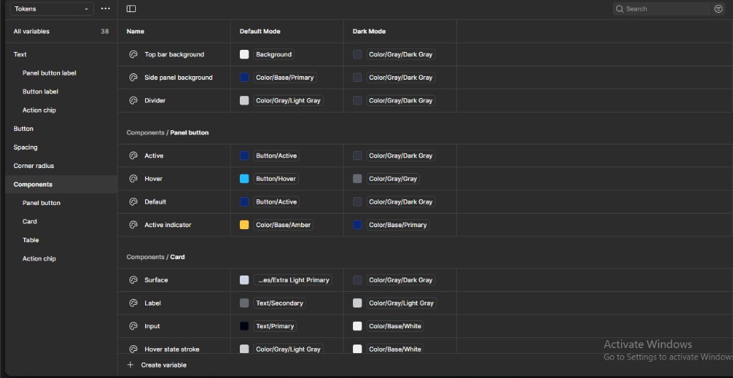
I translated validated wireframes into high-fidelity screens and created a lightweight design system with tokens (color, spacing, typography) so future pages would stay consistent. I sampled existing branding colors and extended them into a clearer palette for accessibility.
Design tokens snapshot (color & spacing) used to keep the UI consistent.
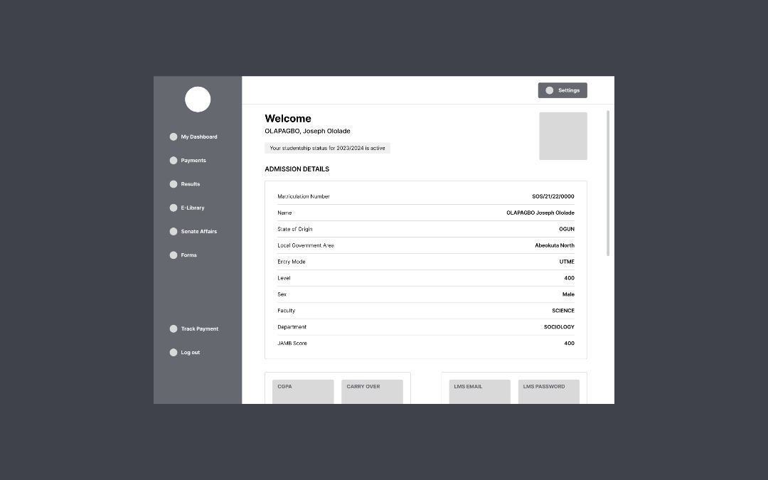
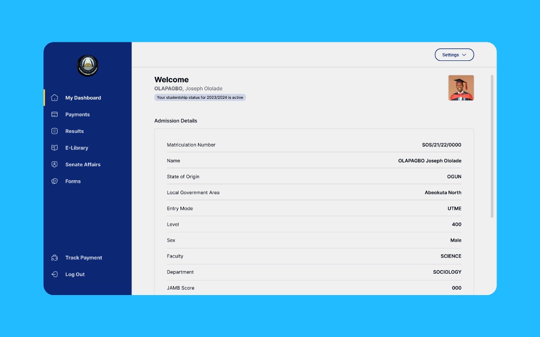
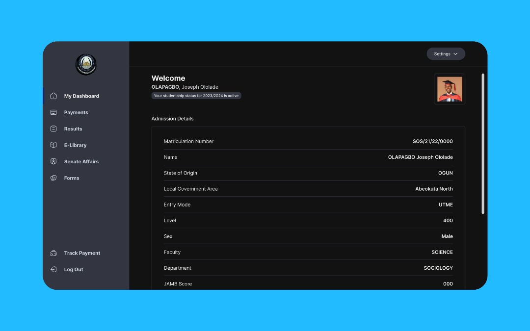
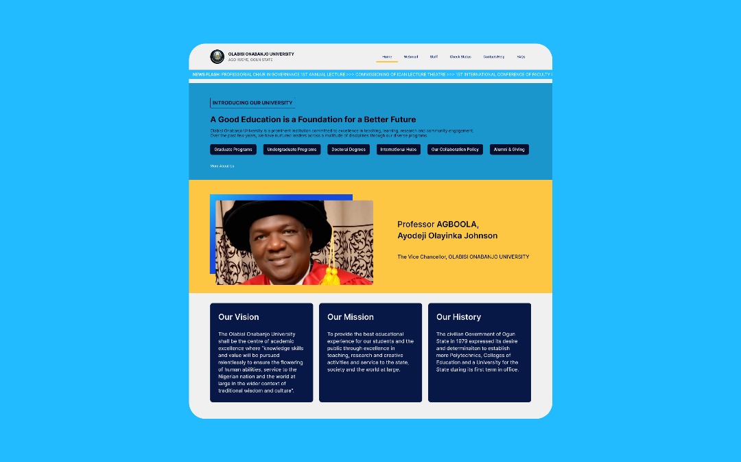
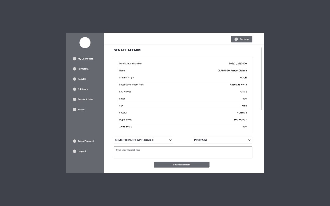
What I shipped
I delivered a redesigned landing page and a reorganized student dashboard with clearer task affordances, improved information hierarchy, responsive layouts and a dark mode option. Icons and microcopy were refined to reduce ambiguity around common flows such as result checking and document printing.
Impact & learnings
The redesign reduced navigational friction for core student tasks and produced immediate positive feedback from peers. When I shared the prototype with 5–6 students and posted it on LinkedIn, an OOU student commented that the university should adopt the new interface. That's a strong validation that the improvements address real needs.
Key learnings: paper-before-pixel helps keep decisions focused, and establishing design tokens early prevents inconsistent UI patterns. The project reinforced how small IA changes can have outsized effects on usability.
Next steps
Run formal usability testing with a broader sample, document developer handoff, and present the redesign internally to HOD/VC to explore adoption opportunities.